Market View
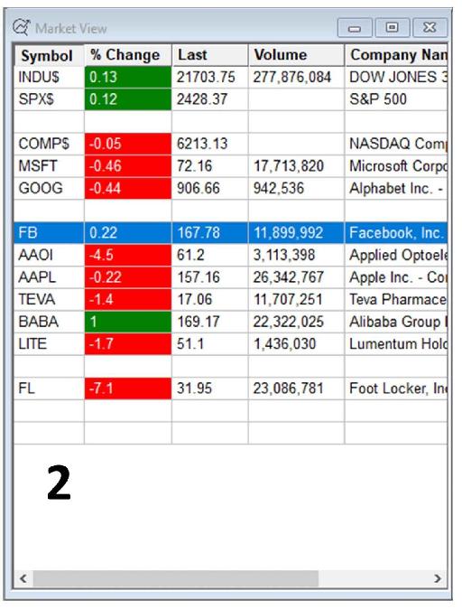
Figure 2.3 below is a screenshot of my Market View window, which is another window in the DAS trading platform. In Market View, you can type in the names of the stocks you would like to monitor and you will see some information about them such as their % change, volume, etc. I personally keep some market indices in my Market View window in order to be easily able to check in on the overall condition of the market.

Figure 2.3 - Market View window in the DAS platform.
Of the various market indices, the most famous ones are:
INDU$: The Dow Jones Industrial Average, also called the Industrial Average, the Dow Jones, the Dow 30, DJIA or simply the Dow, is the most cited stock market index of all. It is one of several indices created by Wall Street Journal editor and Dow Jones & Company co-founder Charles Dow. The index is named after Dow and one of his business associates, statistician Edward Jones. It is an index that tracks how thirty large publicly owned companies based in the United States have traded during a standard trading session in the stock market. The Industrial portion of the name is largely historical, as many of the “modern” thirty companies that are indexed (such as Apple, Coca-Cola and Visa) have little or nothing to do with traditional heavy industry.
SPX$: The Standard & Poor's 500, often abbreviated as the S&P 500, or just the S&P, is a market index based on 500 large companies listed on the NYSE or Nasdaq. It is one of the most commonly followed stock indices, and many consider it one of the best representations of the U.S. stock market, as well as a bellwether for the U.S. economy. An exchange-traded fund (ETF) that closely tracks the S&P 500 index is SPY or SPDR (pronounced spy or spider). Many traders follow and trade SPY instead of the index itself.
COMP$: The Nasdaq Composite is a market index of the stocks listed on the Nasdaq Exchange. Along with the Dow Jones Average and S&P 500, it is one of the three most-followed indices in U.S. stock markets. The composition of the Nasdaq Composite is heavily weighted toward information technology companies and it represents the “high-tech” sector behavior of the overall market.
Price Chart
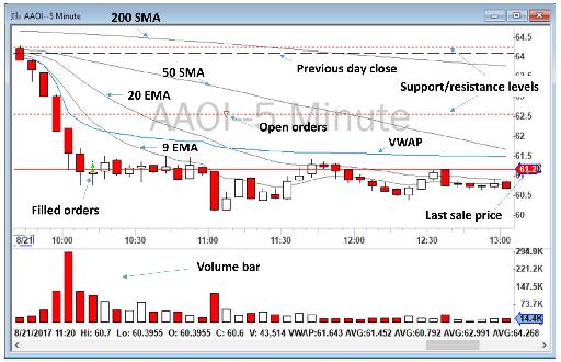
The next important window is the price chart. I use two time frames, 1-minute and 5-minute charts, for each stock I am watching. Figure 2.4 below shows an example of a 5-minute chart with all of the indicators and Studies I have marked on my chart.

Figure 2.4 - Example of a 5-minute chart in the DAS platform, marked with my various indicators and Studies. (If you are reading the print version of this book, this figure will appear in black and white. To access a color copy of it, please visit our website at www.BearBullTraders.com/audiobook.)
I use a white background for my charts, and white/red colors for candlesticks. Some traders like to use dark backgrounds and green/red candlesticks. It is a personal choice. I found a white background easier on my eyes, in the same order that people are more comfortable reading books with white pages and black fonts, rather than books with black paper and white fonts. But again, this is a personal choice. Make your platform appealing to yourself and change your colors as you wish.
For day trading, I keep my charts relatively clean, with a minimal number of indicators displayed. In day trading, you need to process information very quickly, and you need to make decisions extremely quickly. Therefore, I cannot keep track of very many indicators. Here is what I have on my charts:
- Price action in the form of white/red candlesticks
- Volume of shares being traded and average volume line
- 9 Exponential Moving Average of price (9 EMA) and 20 Exponential Moving Average of price (20 EMA)
- 50 Simple Moving Average of price (50 SMA) and 200 Simple Moving Average of price (200 SMA)
- Volume Weighted Average Price (VWAP)
- Previous day’s closing price
- Last sale price
All of the above indicators are automatically being calculated and plotted by my DAS Trader Pro platform. I do not find, calculate or plot these manually. I’ll explain these terms later.
- Support and resistance levels
Having important support and resistance levels on your chart is extremely important. Most of the trading platforms do not automatically find and plot levels of support and resistance. These levels have to be identified manually by traders. I usually find and plot these levels during my pre-market screening for Stocks in Play on my watchlist, or during the day when a new stock hits my scanners. I don’t trade without knowing nearby significant intraday levels of support and resistance.
I keep the color of all of my moving average indicators in gray except VWAP which is colored in blue. VWAP is the most important day trading indicator and needs to be easily and quickly distinguished from other moving averages. I don’t want to have a lot of colors on my charts, so I maintain a white background with mostly red and black coloring. Heavily colored charts are confusing and, over the long term, irritate your eyes and limit your vision. I avoid dark background colors on my charts because my eyes feel achy and weak when processing dark colors for any length of time.
Table of contents
- DISCLAIMER:
- Table of Contents
- Chapter 1: Introduction
- Chapter 2: The Trading Tools and Platform
- Chapter 3: Building Your Trading Watchlist
- Chapter 4: Support and Resistance Levels
- Chapter 5: Price Action, Candlesticks and Trade Management
- Chapter 6: Advanced Day Trading Strategies
- Chapter 7: Risk and Account Management
- Chapter 8: Conclusion and Final Words
- Glossary