Candlestick Patterns
Many traders love to identify complicated chart patterns and make trading decisions based on them. There are hundreds of imaginatively-named candlestick patterns that you will find with a Google search including Head-and-Shoulders, Cup-and-Handle, Abandoned Baby, Dark Cloud Cover, Downside Tasuki Gap, Dragonfly, Morning Star, Evening Star, Falling Three Methods, Harami, Stick Sandwich, Three Black Crows, Three White Soldiers, and many more. Believe me, I did not make any of these names up. These candlestick patterns are really out there. As intriguing as their names might be, many of them, in my opinion, are useless and confusing. They’re exceptionally arbitrary and fanciful.
The biggest problem with fancy chart patterns is wishful thinking. You can find yourself identifying bullish or bearish patterns depending on whether you are in a mood to buy or sell. If you’re in a mood to buy, you will find a bullish pattern, eventually, somewhere. If you feel like selling short, you’ll “recognize” a bearish pattern like Head-and-Shoulders, somewhere. I am skeptical of even the most famous patterns such as the above mentioned Cup-and-Handle and Head-and-Shoulders Patterns.
An example of this sort of subjective and wishful thinking is depicted in Figure 5.4. Figure 5.4 is the exact same daily chart but with two quite different diagonal trend lines. Two traders can look at one chart and draw different trend lines, depending on their mood. None of those patterns are objective in my opinion. Just like seeing a pattern in the clouds or in the stars, many chart patterns and trend lines are difficult to quantify. I skip discussing these types of patterns in this book. Nevertheless, understanding chart patterns is an essential ability of the successful day trader. Therefore, in Chapter 6 I introduce a day trading strategy based on a simple formation: the ABCD Pattern.
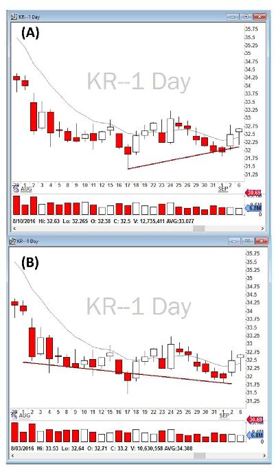
Figure 5.4 - KR daily chart for the summer of 2016. A trend line on the same chart can be drawn whichever way a trader wishes.
There are, however, two chart patterns that I respect on 5-minute charts: (1) the bullish trend of Higher Highs and Higher Lows, and the bearish pattern of Lower Lows and Lower Highs; and (2) Bullish and Bearish Engulfing. Let me explain them in detail in the next section.
Higher Highs and Higher Lows, Lower Lows and Lower Highs
One of the most powerful chart patterns is the so-called Higher Highs and Higher Lows, especially on higher time frames such as 5-minute and daily charts. I usually do not look for it on 1-minute charts. The Higher Highs and Higher Lows Pattern is comprised of two candlesticks, with the high of the second candlestick being higher than the high of the previous one. Similarly, the low of the second candlestick is higher than the low of the previous one, as conceptually shown on the left-hand side of Figure 5.5. As you can see, as a Higher Highs and Higher Lows Pattern unfolds, the buyers are more aggressive and constantly making new highs (compared to previous candlesticks), and the sellers are not strong enough to push the price any lower than the previous candlestick. This is a very bullish trend.
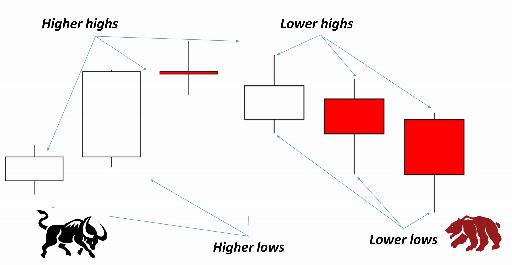
Figure 5.5 - Higher Highs and Higher Lows (bullish pattern) and Lower Lows and Lower Highs (bearish pattern).
Similarly, a bearish pattern is the opposite. When candlesticks are making lower lows and lower highs compared to previous ones, this can indicate a bearish downfall trend as shown conceptually on the right-hand side of Figure 5.5. It does not matter if each candlestick closes red or white, what is important is the positioning of highs and lows compared to the previous candlestick.
Recognizing these patterns has been vital to my trading success. I am very careful not to go long when the stock is constantly making lower lows and lower highs. Similarly, if I am short, and the stock is constantly making higher highs and higher lows, I need to get out before it’s too late. For example, when I show Figure 5.6 to new traders in my class and ask them where the uptrend has started, most of them think that the uptrend has started at candlestick D. In fact, the uptrend can be identified right after candlestick B closes, because candlesticks A and B are already showing a Higher Highs and Higher Lows Pattern. Professional traders may go long after candlestick B closes in order to have a better entry and lower risk, but amateur traders try to jump in at candlestick D, or even E, when the move has already started and is being extended.
Similarly, when I ask new traders where the uptrend ended, they think at candlestick F, but in reality the uptrend is still in effect even after candlestick I, a red candlestick, because there is still the pattern unfolding of higher highs and higher lows. An inexperienced trader may take an early profit at candlestick G when it closes as a red Doji, but professionals keep some of their position to run further until a new 5-minute low is made, and the Higher Highs and Higher Lows Pattern is broken.
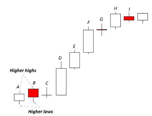
Figure 5.6 - A series of candlesticks showing where a Higher Highs and Higher Lows Pattern has started. Where do you think the uptrend has ended?
Please note that I have not yet introduced any of my trading strategies. It’s important to be patient until you reach Chapter 6 where I explain in detail my preferred strategies. I am not recommending that every time you see a Higher Highs and Higher Lows you should go long, and every time you see a Lower Lows and Lower Highs you should go short. I am not recommending that at all. It’s important to recognize these patterns, but how to successfully utilize them for a successful trade will be discussed in later chapters. Remember, a successful trade requires the analysis of many indicators and parameters, and price action and chart patterns are only one of those.
In the next section I will review some successful and some not so successful trades in order to demonstrate how to make use of this knowledge to manage your trades. Every day, I post the results of my own trading in my YouTube channel, along with an analysis of the strategies I traded as well as how the price action unfolded on the stocks I considered in play that day.
Engulfing Patterns
Another powerful chart pattern that I look for on 5-minute charts is the so-called “Engulfing Pattern”. Bullish and Bearish Engulfing Patterns are one of my favorite candlestick charting patterns. Similar to Higher Highs and Higher Lows, Engulfing Patterns involve two candlestick bars, not one.
Bullish Engulfing Patterns form when a candlestick bar opens lower than the previous candlestick’s close and closes higher than the previous candlestick’s open, as shown conceptually in Figure 5.7. The pattern begins with a candlestick bar that has a small body and is followed by a candlestick bar whose body “engulfs” the previous candlestick’s body.
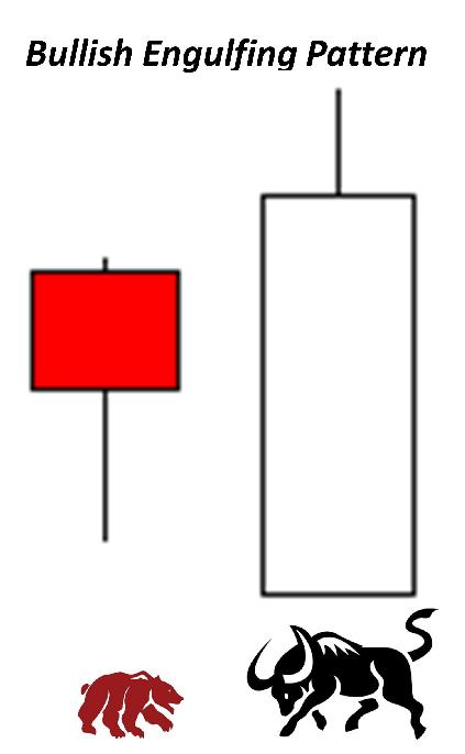
Figure 5.7 - Bullish Engulfing Pattern.
Why is this pattern so bullish? It represents a major defeat, so to speak, for the sellers and/or short sellers (the bears). When the second candlestick bar opens, the sellers are already pushing the prices below the prior candlestick’s close. You may think the bears are winning, however, the buyers will step in and begin purchasing aggressively. Not only are they able to reverse the direction from the open but they also manage to push the prices higher than where the sellers began the previous day. Think of a Bullish Engulfing Pattern as a “surprise victory” in a battle where an infantry division loses not only the gains it made in the previous day but also much more.
I’ve found Bullish Engulfing Patterns to be an excellent reversal indicator (otherwise I wouldn’t be covering them). However, as mentioned many times thus far, this pattern is also one of the indicators and you need to always be looking for subsequent price action and other indicators to confirm the reversal. If prices trade below the pattern again, perhaps the pattern failed.
Similarly, a Bearish Engulfing Pattern occurs at the end of an uptrend and may signal an important reversal. Similar to the Bullish Engulfing Pattern, a Bearish Engulfing Pattern is also formed by two candlesticks. The first candlestick consists of a small body. The second candlestick opens higher than the previous candlestick’s close and closes lower than the previous bar’s open, thus engulfing the first candlestick. Figure 5.8 demonstrates a Bearish Engulfing Pattern.
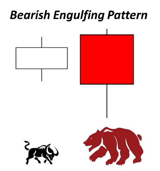
Figure 5.8 - Bearish Engulfing Pattern.
Table of contents
- DISCLAIMER:
- Table of Contents
- Chapter 1: Introduction
- Chapter 2: The Trading Tools and Platform
- Chapter 3: Building Your Trading Watchlist
- Chapter 4: Support and Resistance Levels
- Chapter 5: Price Action, Candlesticks and Trade Management
- Chapter 6: Advanced Day Trading Strategies
- Chapter 7: Risk and Account Management
- Chapter 8: Conclusion and Final Words
- Glossary