Finding Support and Resistance Levels
There are two ways to find trading levels. The first category is comprised of the preexisting and predetermined levels that will often be plotted automatically by trading platforms. There is no judgment involved in finding those patterns. The second category is comprised of the discretionary levels that traders need to find themselves.
Important predetermined levels are:
- Previous day close
- Yesterday’s low and high
- Two days ago low and high
- All-time high and all-time low
- 52-week high and 52-week low
Examples of discretionary levels are:
- Extreme price levels on a daily chart
- Moving averages on daily and 5-minute charts
- Important pre-market levels
In the following sections, I will go into the details of how to find each of these levels.
Previous Day Close
The most important support and resistance level is the previous day close, or PCL, which can be automatically plotted by trading platforms such as DAS.
The closing stock price is significant for several reasons. The PCL is the price that the market makers and institutional traders agree on before the trading day ends. Often many “block trades” happen at the PCL price. As I mentioned earlier, a block trade is a trade of a significantly large number of shares at an arranged price between two parties, frequently outside of the open markets, to lessen the impact on the stock’s price.
Investors, traders, financial institutions, regulators and market makers use the PCL as a reference point to evaluate a stock’s performance over a specific period of time such as one year or one week. In fact, investors and other stakeholders base their decisions on closing stock prices. For example, institutional investors will monitor a stock's closing price in order to make decisions regarding their investment portfolios.
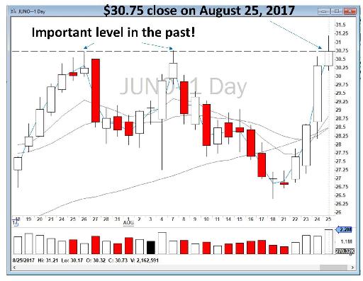
Figure 4.2 - Daily chart for JUNO showing the importance of the previous day close (August 25 vs. August 28, 2017).
To demonstrate the importance of the previous day close, let’s take a look at Figure 4.2, a daily chart of JUNO during the summer of 2017. On August 25, JUNO closed at $30.75/share. The next day, the stock gapped up over 15%. To see the importance of the PCL price of $30.75, look back a few weeks and notice the big bounces from that price level on August 7 and July 26. This amazing bounce is not a coincidence. Market makers and other major players were not willing to pay higher than $30.75 before JUNO reported its earnings. The next day, JUNO gapped up with a good earnings report and, naturally, it was a Stock in Play for us in the chatroom!
Figure 4.3, the 5-minute chart for Mallinckrodt Public Limited Company (ticker: MNK), is another good example of why PCL is an extremely important level for the next trading day. MNK was a Stock in Play on January 19, 2017. After a weak Open, the price held below VWAP. I went short, but there was no nearby support and resistance level except the previous day close at $46.52 (the dashed line on my chart). Therefore, I decided to go short from VWAP at around $47.80 for the profit target of the previous day close at $46.52, a nice $1.20 per share profit.
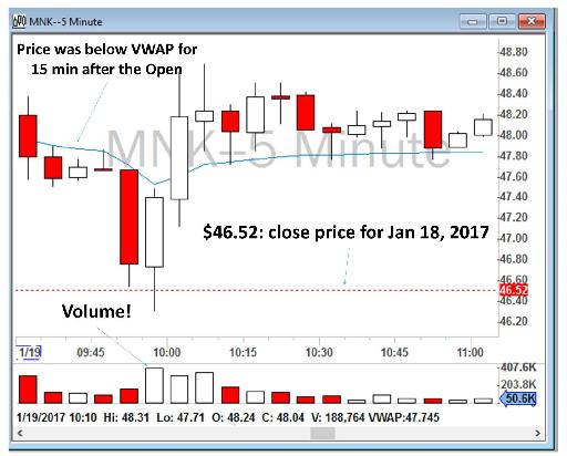
Figure 4.3 - 5-minute chart for MNK showing the importance of the previous day close (January 18 vs. January 19, 2017).
For another example, let’s take a look at Figure 4.4, the 5-minute chart for Barracuda Networks, Inc. (ticker: CUDA) on January 10, 2017. The same price action can be seen at the Open. CUDA gapped up in the pre-market because of a good earnings report. At the Open, it was sold off heavily, perhaps because overnight shareholders and long-term investors started to sell their shares for a profit. The stock tested the VWAP for about twenty minutes and then sold off in a high volume toward the previous day close of $23.81. Its price bounced back later, during Mid-day, toward the VWAP, after it could not break the previous day close. Later, in the early afternoon, the price sold off again toward the previous day close before it bounced back yet again.
In this example too, the previous day close level of $23.81 acted as a strong support level. In both morning and afternoon trading, a short sell opportunity was possible from VWAP at around $24.40 to $23.81. I did not take this trade though as I was trading another stock around the same time.
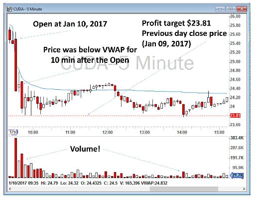
Figure 4.4 - 5-minute chart for CUDA for January 10, 2017 demonstrating the importance of the previous day close as a support level.
PriceMarker: Y Low/High and YY Low/High
Similar to PCL, yesterday’s and the day before yesterday’s low and high are often important intraday levels for the next trading days. I use a tool called PriceMarker, which is referred to as a Study in my DAS platform, to automatically put four levels on my chart for any stock that I am watching.
| Yesterday’s Low |
Y Low |
| Yesterday’s High |
Y High |
| Two days ago Low |
YY Low |
| Two days ago High |
YY High |
For every ticker that I click, I will then automatically have five support and resistance levels plotted on my chart: previous day close plus yesterday’s high, yesterday’s low, two days ago high and two days ago low. These are very, very important to support and resistance. Figure 4.5 is a screenshot of the PriceMarker Studies window and Figure 4.6 is an example of a chart with these various levels automatically plotted by PriceMarker.
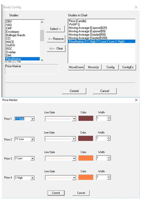
Figure 4.5 – PriceMarker Studies window in my DAS platform.
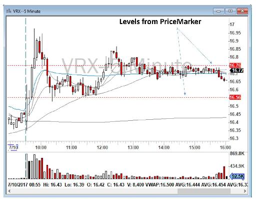
Figure 4.6 - 5-minute chart for VRX demonstrating how PriceMarker automatically plots various support and resistance levels on a chart.
Now let’s take a look at VRX for July 10, 2017. As you can see in Figure 4.6, I had two levels on my chart automatically drawn from PriceMarker. You will note that the price level of $16.56, which was YY Low, did act as a strong resistance level during the morning and Late-Morning sessions. The stock bounced from that level many times before heading above VWAP. In the afternoon trading session, VRX never was able to break above the Y High of $16.76.
Another example is Snap Inc., the developer of Snapchat (ticker: SNAP) on February 20, 2018, as set out in Figure 4.7 below. SNAP gapped down over 5% in the pre-market and was trading near $19. In the morning session, at around 10 a.m., it recovered some of the losses and closed strongly above VWAP. I went long at $19.40 with the profit target of $19.75, which was yesterday’s low. I sold before it reached my target. After around 30 minutes, when it had finished an ABCD Pattern consolidation, I went long again at $19.60 and sold at $19.73. I kept the last portion of the position with the hope of breaking $19.75, but I impatiently sold the rest at $19.66 at around 11:45 a.m.
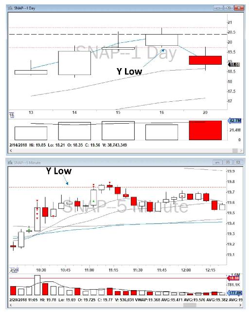
Figure 4.7 - Example of a trade on SNAP based on yesterday’s low.
Another example is shown in Figure 4.8, where I was trading United States Steel Corporation (ticker: X) on February 26, 2018. The previous day levels (on February 23 and 22) are shown in the top half of the figure. As you can see, by referring to the previous day, I mean the previous trading day and not the previous calendar day. There was of course no trading on the weekend of February 24 and 25, 2018. The stock opened at around $45.25 and I shorted it at the Open with the profit target of around $44, which was Y and YY high.
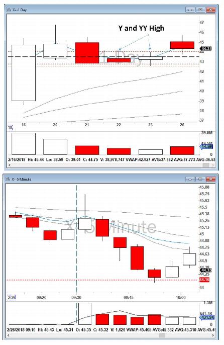
Figure 4.8 - Example of a trade on X based on the previous day’s levels.
The beauty of the five above-mentioned support and resistance levels - 1) previous day close or PCL, 2) Y Low, 3) Y High, 4) YY High, 5) YY Low - are that those levels are automatically drawn by your trading platform, and you do not need to look for any of them. They will always be marked on the chart for any stock I choose to look at.
However, as mentioned at the beginning of this section, there are additional levels that traders need to find manually, and developing that skill requires practice.
Pre-Market Levels
As explained in Chapter 3, Stocks in Play often have clean pre-market activity, and that is one of my important criteria for shortlisting the Gappers for my final watchlist. These are active stocks and you can find patterns in their pre-market activity. Two powerful levels for day traders are the high and the low of the pre-market activity. Often these two levels are important trading levels during the market trading hours as well. Let’s review some examples:
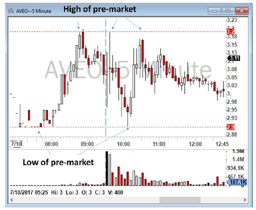
Figure 4.9 - Example of pre-market levels impacting trading in AVEO.
As you will see in Figure 4.9, on July 10, 2017, AVEO gapped up. The high of the pre-market was around $3.20 and the low of the pre-market was around $2.90. You can see in this figure that at 9:30 a.m., when the market opened, AVEO went to $3.20, and then sold off to $2.90, and then bounced back again toward the high of the pre-market which is now the high of the day.
Another example is NVDA for July 10, 2017. As you can see in Figure 4.10, during the pre-market NVDA gapped up more than 3% and traded in a narrow range between $148.83 and $149.89. The stock pushed higher at the Open, and then sold off toward the low of the pre-market, which held as an excellent support. The stock later moved higher and tested $149.89 as a potential resistance.
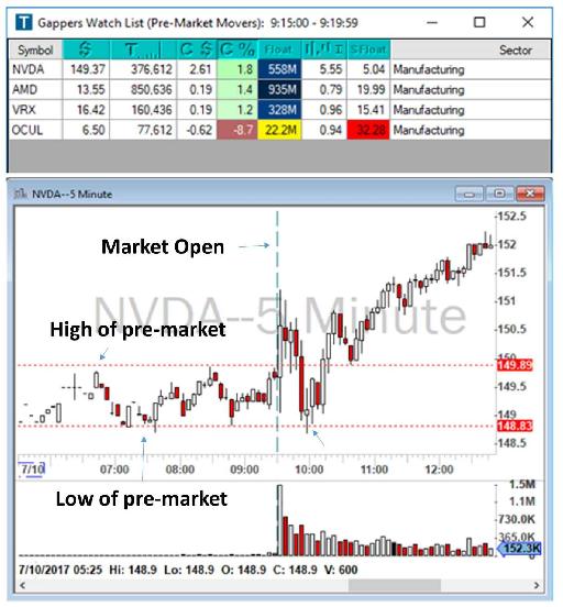
Figure 4.10 - Example of pre-market levels impacting trading in NVDA.
You may correctly ask, how can I trade based on these levels? At this moment, do not even think about making a trade, just focus first on how to find these various levels, and secondly on understanding how the price of a stock respects these levels. I will discuss trading strategies later in the book but, before making any trade, you need to be able to accurately find these levels.
Moving Averages
Moving averages on higher time frames such as daily charts and 5-minute charts are important support and resistance levels, especially the larger moving averages such as 50 SMA and 200 SMA. When the price reaches these levels it often bounces. You can expect significant activity around these moving averages.
For example, let’s take a look at Figure 4.11, AAOI’s daily chart for October/November 2016. As marked, these bounces are excellent.
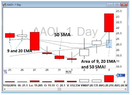
Figure 4.11 - AAOI daily chart for October/November 2016 showing moving averages acting as support and resistance levels.
Another example is Figure 4.12, GLPG in August 2017. This stock gapped up more than 14% in the pre-market on August 10 and opened at $83 but sold off later during the day close to its 50 SMA at around $78. In my analysis during the pre-market, I marked the area near $78 as a support and resistance level, as shown on the chart.
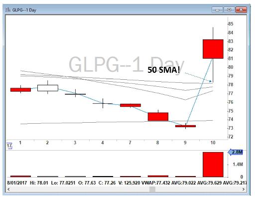 Figure 4.12 - GLPG daily chart showing how 50 SMA acted as a support and resistance level.

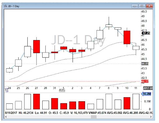
Figure 4.13 - JD daily chart.
Another example is JD in August 2017. On Friday, August 11, 2017 JD closed at $45.80. On Monday, August 14, the stock gapped down to $44 and it was obvious that it would be in play. I quickly looked at the daily chart, Figure 4.13, and found that 50 SMA was ~$42.17. As you will see in Figure 4.14, I marked it on my chart (dashed line) and then went to see how the stock was being traded in the pre-market.
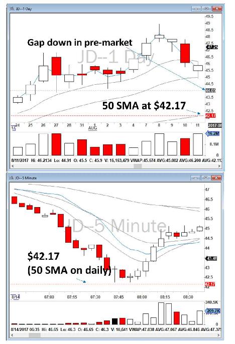
Figure 4.14 - Analysis of JD pre-market activity.
As you can see, JD sold off to around $42.17 and bounced back from that, even in the pre-market activity!
Another example is IONS on October 24, 2017. As you can see in Figure 4.15, the stock gapped down from a close of $62.50 on October 23, 2017 to around $56.25 in the pre-market of October 24. The stock on the daily chart was very close to its 50 SMA and, as you will note, during the trading day of October 24 it bounced back from both 20 EMA and 50 SMA.
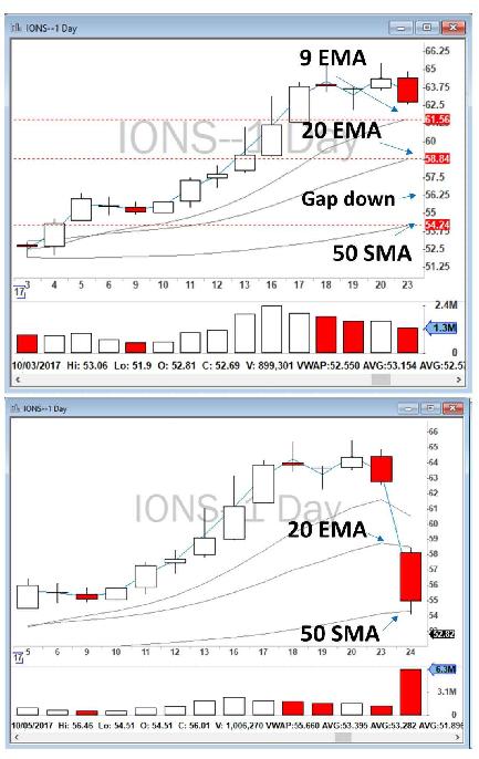
Figure 4.15 - Daily charts for IONS demonstrating moving averages acting as a support and resistance.
I took an Opening Range Breakout short below VWAP with the profit target of $54.21. I covered my position on the way down toward $54.21 for a good profit of $474. As you can see in Figure 4.16, the stock bounced back from that level!
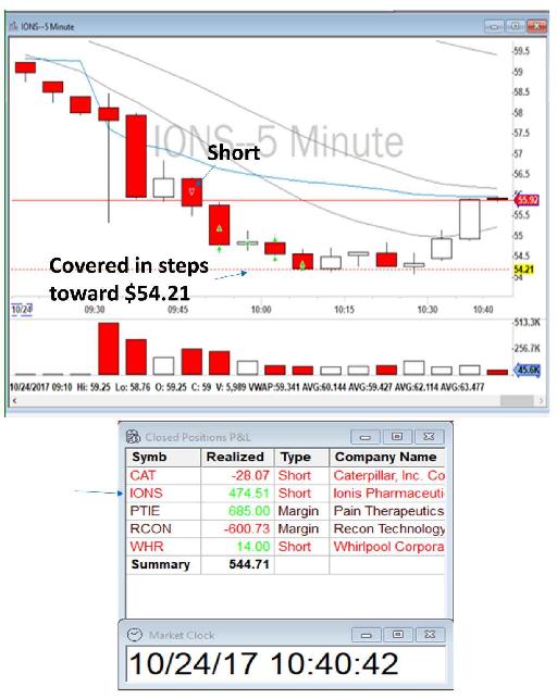
Figure 4.16 - Summary of the trade I took on IONS on October 24, 2017.
Many examples can be found on daily charts to show how moving averages can act as powerful support and resistance levels. Below, for example, in Figure 4.17, you can see where I marked the price as bouncing up from 200 SMA on the daily chart of GTN for November and December 2017.
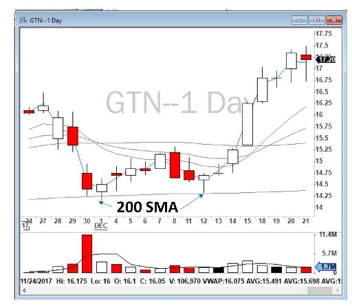
Figure 4.17 - GTN daily chart demonstrating how moving averages can act as support and resistance levels.
Another example can be seen in the trading of LITE on December 13, 2017 when its stock gapped down with huge trading volume but with 9 EMA acting as a resistance. In the next few days, 20 EMA also acted as a higher resistance level (all marked by arrows in Figure 4.18).
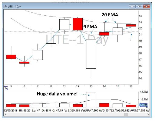
Figure 4.18 - LITE daily chart demonstrating moving averages acting as a resistance level.
In addition to daily charts, moving averages on intraday charts such as 5-minute and 1-minute can also act as potential support and resistance. For example, let’s look at Figure 4.19, the intraday chart of FOLD on October 4, 2017. As you can see, FOLD sold off at the Open and after a consolidation I went short at 9:40 a.m. with the profit target of moving average. I covered my position on the 200 SMA. I made $594 from that trade with 2,000 shares.
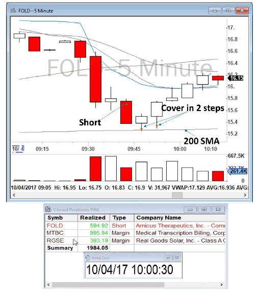
Figure 4.19 - FOLD 5-minute chart describing the trade I took on October 4, 2017 using moving averages as a support and resistance.
Even on 1-minute charts you can see that moving averages can act as potential support and resistance. For example, on November 2, 2017, JUNO bounced back from 200 SMA on a 1-minute chart. I took that trade short again and covered in a few steps toward the moving average, as shown below in Figure 4.20:
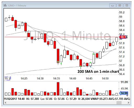
Figure 4.20 - JUNO 1-minute chart showing the trade I took on November 2, 2017 using moving averages as a support and resistance.
Please note that as a rule of thumb, the higher the time frame and the higher the moving averages are, the stronger the support and resistance levels will be. A 200 SMA on a daily chart is perhaps the strongest support and resistance level. Moving averages on 1-minute charts on the other hand tend to be less strong.
Daily chart >> 5-minute chart >> 1-minute chart
200 SMA >> 50 SMA >> 20 EMA >> 9 EMA
Reversals and Extremes on Daily Charts
Reversal points on daily charts are important levels of support and resistance. As mentioned previously, before the market opens, I go back to the daily charts and find price levels that have been shown in the past to be critical. Often on a daily chart you can see significant price reversals for multiple days in those areas. A large wick to the upside or downside on a daily chart will immediately catch my attention (please see Figure 4.22 where I have marked with an arrow an example from January 5, 2017 for Michael Kors Holdings Ltd. (ticker: KORS)). I usually try to identify that level with a line that touches the maximum number of reversals or wicks. The more of a line that is touching extreme price lines, the more that the line is a better support and resistance and has more value. Sometimes it is not clear which line is the optimum line, and in those situations all you can do is just draw the best that you can.
The price must have a clear bounce from that level. If you are not certain if the price has bounced in that level, then it is probably not a support and resistance level. Important support and resistance levels on daily charts stand out. They shout at you: “grab me by the face”.
For day trading, it is better to draw support and resistance lines across the extreme prices or wicks on daily levels rather than across areas where the bulk of the bars stopped. This is the complete opposite of swing trading. For swing trading, you need to draw support and resistance lines across the edges of congested areas where the bulk of the bars stopped rather than across the extreme prices. Swing traders often ignore those wicks on daily charts. This is because the close price is more important for swing trading than the extreme wicks in daily bars are. The close price of a stock on a daily chart is the price that the market makers and professional traders have agreed on. Previous extreme high and low wicks have been made by day traders, so you should look at those. To better illustrate these above points, let’s take a look at Figure 4.21, a daily chart for SCTY without support and resistance lines and another daily chart which includes those lines.
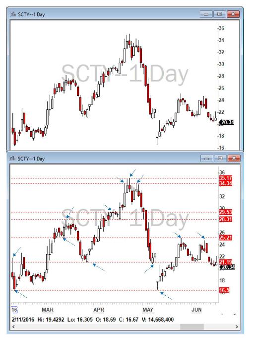
Figure 4.21 - Example of SCTY daily chart firstly without and then with support and resistance lines plotted.
You will see that I marked areas that the price bounced back on the daily chart.
Another example is shown in Figure 4.22 where two levels are noted, and I marked the areas that caught my attention in order to draw those specific levels. Please note that there are more levels that can be plotted on this chart, I just highlighted these two levels as an example.
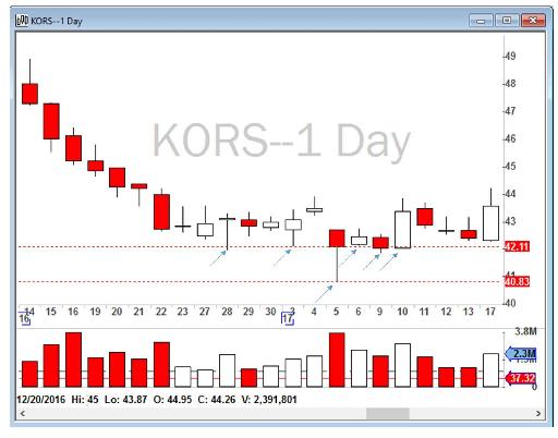
Figure 4.22 - KORS daily chart showing support and resistance lines.
Support and resistance lines on daily charts are not always easy to find, and at times you will not be able to draw anything clear. If I cannot see anything clear, I don’t have to draw anything. There is a good chance that other traders will also not see those lines clearly and therefore there is no point in forcing myself to draw support and resistance lines. In that case, I will plan my trades based on the VWAP or moving averages or other levels that I earlier discussed.
One important hint for drawing support and resistance lines on daily charts is that you should always look at the most recent and relevant data closest to the pre-market price activity. If the price of the stock is at $20 in the pre-market, there is no point in finding support and resistance lines in the region when it was being traded at $40. It is unlikely that the stock will move and reach that area. Go back in time to find the most recent data where prices were close to your current day trading range. Sometimes you need to go back a few weeks, and sometimes you may need to go back several years to find any nearby levels.
To illustrate this point, let’s take a look at Figure 4.23, the daily chart of HD.
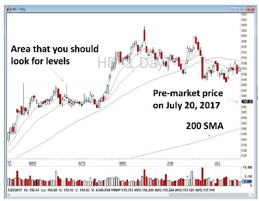
Figure 4.23 - HD has gapped down, let’s find the levels.
On July 20, 2017, Home Depot Inc. (ticker: HD) gapped down in the pre-market and was being traded at around $147. There is no level nearby, except a 200 SMA on the daily chart at around $142. To find more relevant levels, I had to go back in time and find the price action in April 2017. I zoomed in on that area and found relevant levels as marked in Figure 4.24. I pointed arrows at those areas that captured my attention when looking for these levels.
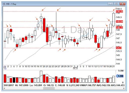
Figure 4.24 - Going back in time to find relevant support and resistance levels for HD.
Now let’s see how HD actually traded on July 20, 2017. Figure 4.25 shows its intraday activity. As you can see, HD sold off heavily at the Open and broke most of the levels I had marked. It did have a quick bounce from $148.33 back to VWAP at the Open (shown with an arrow), but the selling pressure was so strong that it could not hold and eventually broke that level before 10 a.m. Eventually, HD nicely held the $145.90 level that I had earlier determined (see Figure 4.24, the daily chart for March and April 2017).
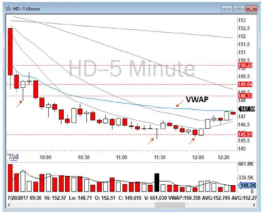
Figure 4.25 - HD intraday chart on July 20, 2017.
I tried to draw the best lines possible, although another trader might look at the same points and draw their lines slightly differently. That is why it is important to always remember that support and resistance lines are actually an “area” and not exact numbers. For example, when you find an area around $145.90 as a support line, you must expect price action movement around that number but not at exactly $145.90. Depending on the price of the stock, an area of 5 to 10 cents is safe to assume. In the example above, the real support area might range from $146 to $145.85 – ish!
Another example of extreme price bounces can be seen in Figure 4.26, the daily chart for KORS for December 2016 and January 2017. Again, I marked those levels that I found, and I pointed arrows at areas that captured my attention in order to draw those lines.
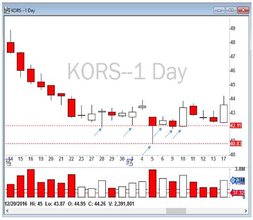
Figure 4.26 - KORS daily levels marked by me, with arrows indicating areas that caught my attention and assisted me in plotting these daily levels.
Price levels at all-time highs, all-time lows, 52-week highs, and 52-week lows are extremely important. For example, let’s review Zogenix, Inc. (ticker: ZGNX) on October 2, 2017. As you can see in Figure 4.27, ZGNX gapped up over 4% in the pre-market and was being traded at around $36.50. Just a day before, it had a huge run from $15 to $35. Reviewing its daily chart, I found that there was no level nearby until I found the all-time high price level of $41.47 back in 2014, as also shown in Figure 4.27. I used a weekly chart for this book only because I could not properly insert a daily chart for illustrative purposes, it would have been unreadable, but if you were looking at its daily chart, you would still find that $41.47 level.
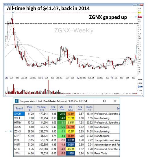
Figure 4.27 - ZGNX has appeared on my Gappers watchlist for October 2, 2017. I had to go back to 2014 to find the all-time high of $41.47, as shown on this ZGNX weekly chart.
When the market opened on October 2, 2017, ZGNX moved up at the Open toward the $41.47 level which, not surprisingly, acted as a resistance. For about 20 minutes, at around 11 a.m., ZGNX tried to break that level, but it could not, and it then slowly sold off back to VWAP and closed near the VWAP, as shown in Figure 4.28.
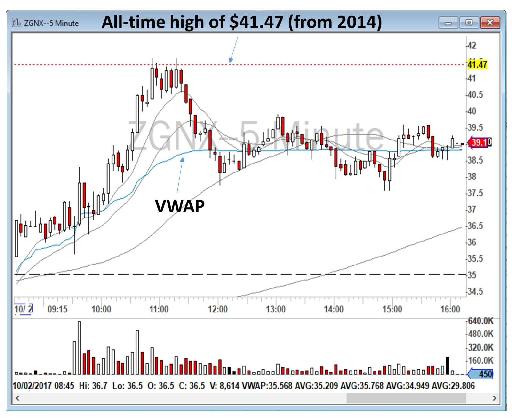
Figure 4.28 - 5-minute chart for ZGNX for October 2, 2017 showing that the all-time high level of $41.47 (from back in 2014) acted as a strong resistance (in 2017).
52-week highs and 52-week lows are additional important levels that retail and institutional traders look at. For example, let’s review United States Steel Corporation (ticker: X) on March 1, 2018. The stock gapped up from its previous day close on February 28, 2018 and I was long biased on it for a move forward toward its 52-week high. As you can see in Figure 4.29, the stock was being traded near its 52-week high, and I was hoping I could take that trade for the break of that level.
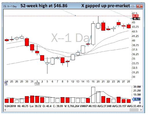
Figure 4.29 - Daily chart of X showing its 52-week high from less than two weeks earlier.
As soon as the market opened, X sold off below VWAP, but then bounced back from 50 SMA. As soon as it came above VWAP, I went long and sold toward $46.30 (high of the day at that time) and $46.86 (the 52-week high) for a $490 profit with 1,600 shares. As you can see in Figure 4.30, X sold off heavily at its 52-week high of $46.86. This level proved to be a very strong resistance.
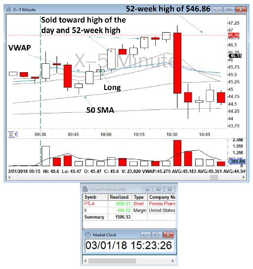
Figure 4.30 - X showing activity near its 52-week high of $46.86.
To summarize what I have discussed so far:
- Previous day close is one of the most important levels on your charts.
- Previous day’s high and low (usually Y and YY: yesterday and the day before) are important and some platforms will automatically draw these lines for you. In DAS, the PriceMarker Study will do that for you.
- Clear pre-market levels (low and high) can often be important intraday levels.
- Moving averages on both daily charts and intraday charts are also often important levels. The higher the moving average is, the stronger the level (for example, 200 SMA is a much more powerful level than 9 EMA). In addition, the higher the time frame the moving average is in, the stronger the level it is. For example, a 20 EMA moving average on a 5-minute chart is much stronger than 20 EMA on a 1-minute chart.
- Extreme price levels on daily charts that the price has bounced back from are important levels. The kangaroo tails (large wicks to the upside or downside) are extremely important levels.
- Always look at the most recent data to find levels, and try to find levels near the pre-market price. There is no point in finding levels that would be unlikely to be in the price action range for that day.
- All-time highs, all-time lows, 52-week highs, and 52-week lows are also important levels that should be marked in the pre-market screening.
Placing support and resistance lines, although tricky, is actually quite simple once you get the hang of it. It does take practice though. Please feel free to watch me every morning in our chatroom when I find the support and resistance levels for my Stocks in Play.
Table of contents
- DISCLAIMER:
- Table of Contents
- Chapter 1: Introduction
- Chapter 2: The Trading Tools and Platform
- Chapter 3: Building Your Trading Watchlist
- Chapter 4: Support and Resistance Levels
- Chapter 5: Price Action, Candlesticks and Trade Management
- Chapter 6: Advanced Day Trading Strategies
- Chapter 7: Risk and Account Management
- Chapter 8: Conclusion and Final Words
- Glossary