Strategy 2: ABCD Pattern / Reverse ABCD Pattern
The ABCD Pattern is one of the most basic and easiest patterns to trade, and it is an excellent choice for beginner and intermediate traders. Although it is simple and has been known for a long time, it still works effectively because so many traders are still trading it. You should do whatever all of the other traders are doing because a trend is your friend. In fact, a trend may very well be your only friend in the market.
Let’s take a look at this pattern in Figure 6.10:
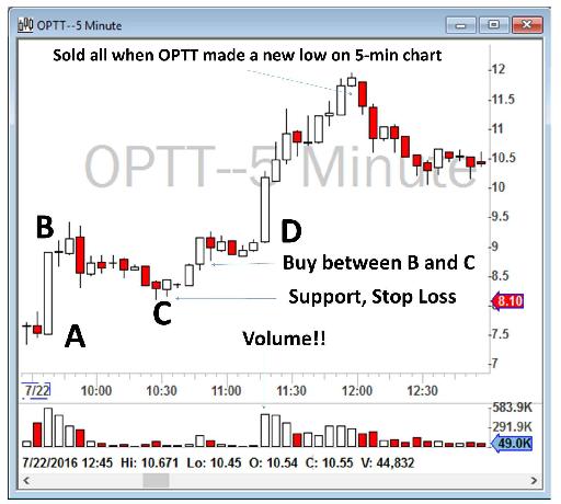
Figure 6.10 - Example of an ABCD Pattern on OPTT.
ABCD Patterns start with a strong upward move. Buyers are aggressively buying a stock from point A and making constantly new highs of the day (point B). You want to enter the trade, but you should not chase the trade, because at point B it is very extended and already at a high price. In addition, you cannot say where your stop loss should be. You must never enter a trade without knowing where your stop is.
At point B, traders who bought the stock earlier start slowly selling it for profit and the price comes down. You should still not enter the trade because you do not know where the bottom of this pull back will be. However, if you see that the price does not come down from a certain level, such as point C, it means that the stock has found a potential support. Therefore, you can plan your trade and set up stops and a profit taking point.
The above screenshot, marked as Figure 6.10, is of Ocean Power Technologies, Inc. (ticker: OPTT) at July 22, 2016, when they announced that they had a new $50 million contract to build a new ship (There’s a fundamental catalyst! Remember Chapter 3?).
The stock surged up from $7.70 (A) to $9.40 (B) at around 9:40 a.m. I, along with many other traders who missed the first push higher, waited for point B and then a confirmation that the stock wasn’t going to go lower than a certain price (point C). When I saw that point C was holding as a support and that buyers would not let the stock price go any lower than $8.10 (C), I bought 1,000 shares of OPTT near point C, with my stop being a break below point C. I knew that when the price went higher, closer to point B, buyers would jump on massively. As I mentioned before, the ABCD Pattern is a very classic strategy and many retail traders look for it. Close to point D, the volume suddenly spiked, which meant that many more traders were jumping into the trade.
My profit target was when the stock made a new low on a 5-minute chart, which was a sign of weakness. As you can see in Figure 6.10, OPTT had a nice run up to around $12 and showed weakness by making a new low on a 5-minute chart at around $11.60. That is when I sold all of my position.
Figure 6.11 is another example, this time for SPU on August 29, 2016. There are actually two ABCD Patterns in this example. I marked the second one as abcd pattern. Usually, as the trading day progresses, volumes become lower and therefore the second pattern is smaller in size. Please note that you will always have high volumes at points B and D (and in this instance also at points b and d).
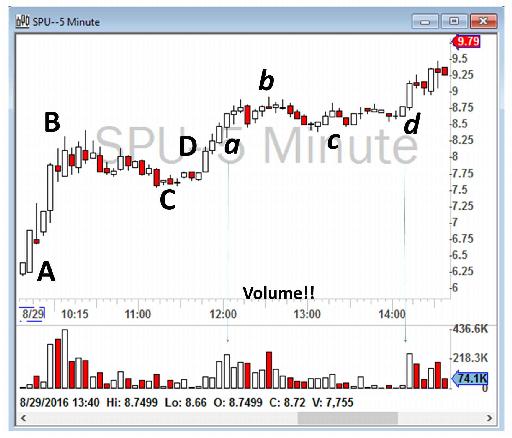
Figure 6.11 - Example of ABCD Pattern and abcd pattern on SPU.
The next example, as shown in Figure 6.12, is for Advanced Micro Devices, Inc. (ticker: AMD) on July 24, 2017. At the Open, AMD moved from $14 to $14.21 and sold off back to the VWAP. For 10 minutes, it consolidated above the VWAP and again moved higher toward the then high of the day of $14.21 and the daily level of $14.42. A good entry could be identified from my 1-minute chart when the stock found a support at VWAP and moved toward point B with higher than previous candle volume. The stop loss could have been a break below VWAP and the daily level of $14.42 would have been a reasonable profit target.
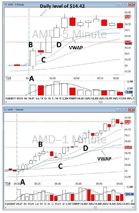
Figure 6.12 - Example of ABCD Pattern on AMD.
The next example, as set out in Figure 6.13, is for Micron Technology, Inc. (ticker: MU) on March 12, 2018. When you look at the 5-minute chart (the top image), you can see that at the Open, MU moved from $56.38 (point A) to $57.75 (point B) and sold off back to the VWAP for 15 minutes. It consolidated above the VWAP (point C) and again moved higher toward the then high of the day of $57.75. A good entry on the 5-minute chart would be when MU made a new 5-minute high above VWAP, as marked in the top image. I personally traded it earlier in the day, when another ABCD Pattern had appeared on my 1-minute chart.
In this example, you can see several different ABCD Patterns on the 1-minute and 5-minute charts. I’ve marked two on the 1-minute chart and one on the 5-minute chart. The entry marked on the 5-minute chart is exactly the same as the entry I marked for the second ABCD Pattern on the 1-minute chart.
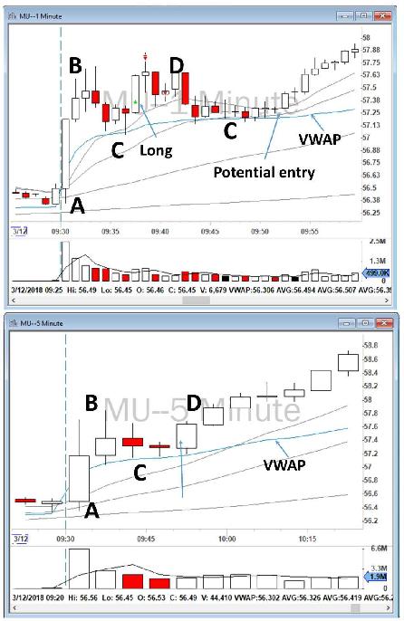
Figure 6.13 - Example of ABCD Patterns on MU
As set out on the 1-minute chart, when the stock found a support at VWAP and moved toward point B with high volume (significantly higher than the previous candle volume), I went long and sold toward the high of the day. My initial stop loss was a break below VWAP at around $57.13. As soon as I sold some of my position, I adjusted my stop loss to the break-even and then finally got out at the break-even. I unfortunately did not make a large profit on this trade as I sold only 25% of my position and then got stopped out of the remaining 75% of my position at the break-even. Figure 6.14 is a screenshot of my P&L.
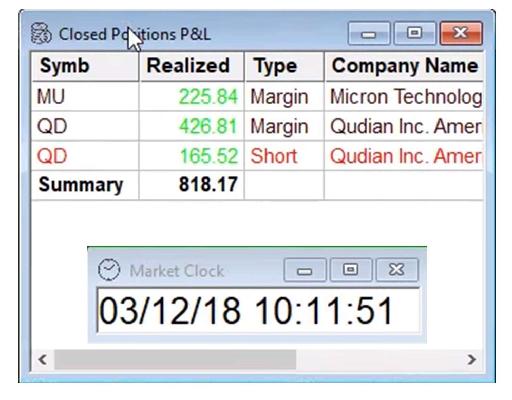
Figure 6.14 - My P&L on MU.
Another excellent ABCD Pattern can be seen on NXT-ID Inc. (ticker: NXTD) on December 21, 2017, as set out in Figure 6.15. When you look at the 5-minute chart (on the top image), you will see that at the Open, NXTD moved from $4 (point A) to $6.74 (point B) and sold off back to the VWAP (point C) at around 10:15 a.m. For about 20 minutes, it consolidated above the VWAP and again moved higher toward the then high of the day of $6.74. I went long near point D at $6.50 and sold toward the high of the day above $7. However, a better entry could have been earlier if I had paid attention to the 1-minute chart. As you can see, I went long too late, just before the break of the high of the day, but $6.25 would have been a much better entry.
Please note that looking closely on a 1-minute chart can also help define a better stop loss. On the 5-minute chart, the only point C (support level) is really the VWAP at around $5, but that is a very far stop loss. A closer look at the 1-minute chart shows that 9 and 20 EMA around $6.25 could be used as a potential support level. If you break that level, it most likely will head lower toward VWAP as many traders will send stop loss orders to get out. In order for you to compare, I also marked the other support level on the 1-minute chart as point C.
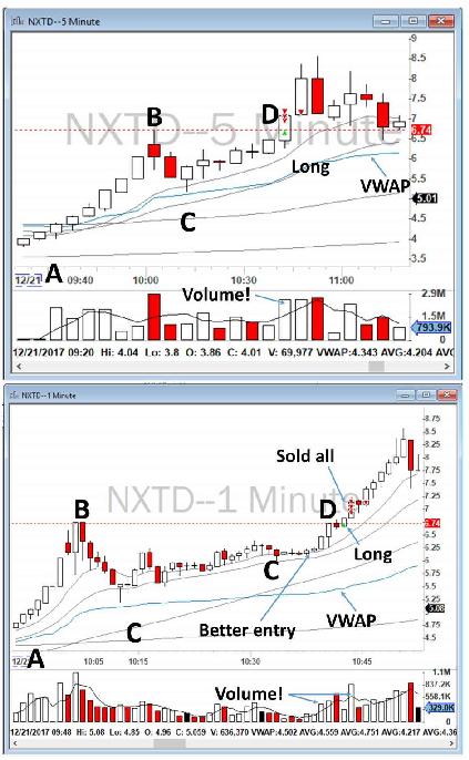
Figure 6.15 - ABCD Pattern on NXTD.
Another example of ABCD Patterns can be seen on Applied Optoelectronics, Inc. (ticker: AAOI) on July 24, 2017, as set forth in Figure 6.16. I did not take this trade, but you can see two ABCD Patterns on my 5-minute chart, which are also marked on my 1-minute chart. Now, to practice, before reading ahead, try to think through the potential trades you could take with these two charts. Feel free to email me your answer at [email protected] and I will share my thoughts on it with you.
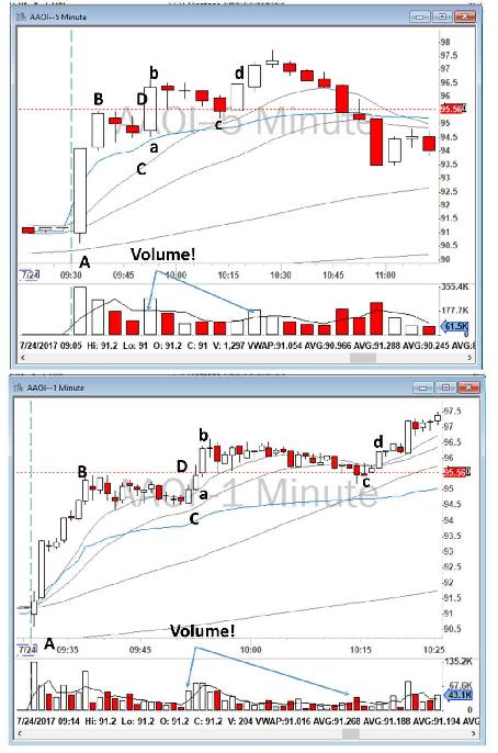
Figure 6.16 - ABCD and abcd Patterns on AAOI.
Now that you have practiced this strategy, let’s do another practice run, this time on The Finish Line, Inc. (ticker: FINL) on August 29, 2017, as set out in Figure 6.17. I executed an ABCD Pattern trade on FINL and I recall making good money on it. I identified those trading set ups on both my 5-minute and 1-minute charts as ABCD, abcd, and áƀćď.
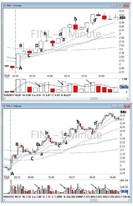
Figure 6.17 - ABCD, abcd and áƀćď Patterns on FINL.
The trade that I took was only on the first pattern: the ABCD on the 5-minute chart. I made enough on that trade so I really had no need to keep trading. I entered the trade at $7.50 and exited at $7.98 and $7.80, as shown in Figure 6.18.
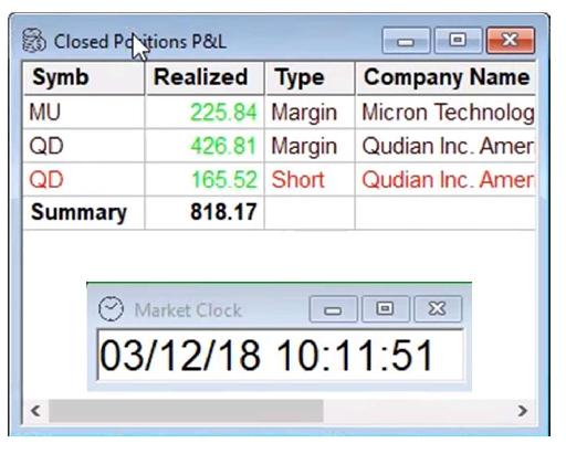
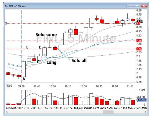
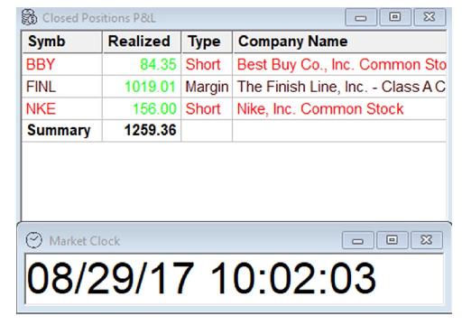
Figure 6.18 - My trade on FINL.
To summarize my trading strategy for the ABCD Pattern:
- When I find a Stock in Play, either from my Gappers watchlist or from one of my scanners, or when I’m advised by someone in our chatroom that a stock is surging up from point A and reaching a significant new high for the day (point B), I wait to see if the price makes a support higher than point A. I call this point C. I do not jump into the trade right away.
- I watch the stock during its consolidation period. I choose my share size and stop loss and profit target exit strategy.
- When I see that the price is holding support at point C, I enter the trade close to the price of point C in anticipation of moving forward to point D or higher. Point C can also be identified from a 1-minute chart. It is important to look at both time frames in order to gain a better insight.
- My stop is the loss of point C. If the price goes lower than point C, I sell and accept the loss. Therefore, it is important to buy the stock close to point C to minimize the loss. Some traders wait and buy only at point D to ensure that the ABCD Pattern is really working. In my opinion, that approach basically reduces your reward while at the same time increases your risk.
- If the price moves higher, I sell half of my position at point D, and bring my stop higher to my entry point (break-even).
- I sell the remaining position as soon as my target hits or I sense that the price is losing steam or that the sellers are acquiring control of the price action. When the price makes a new low on my 5-minute chart, it is a good indicator that the buyers are almost exhausted.
Reverse ABCD Pattern
The Reverse ABCD Pattern is a mirror image of the ABCD Pattern but for selling short instead of going long. Thus all of the rules and tactics apply equally to both patterns.
To demonstrate a Reverse ABCD Pattern, let’s review Figure 6.19, a trade I took on Amicus Therapeutics, Inc. (ticker: FOLD) on October 4, 2017. At the Open, the stock sold off heavily and from $16.50 (point A) made a low of the day of $15.63 (point B). FOLD later consolidated between the low of the day and the $16.08 level that I had identified in the pre-market. As soon as FOLD started toward the then low of the day of $15.63 (point B), and to make a new low of the day (point D), I went short and covered toward the 200 SMA on my 5-minute chart for a nice $595 profit. The stop loss in this case was a new 5-minute high or break of $16.08 (which so far had acted as a resistance level).
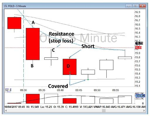
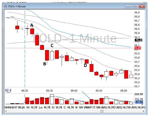
Figure 6.19 - Reverse ABCD Pattern on FOLD.
Table of contents
- DISCLAIMER:
- Table of Contents
- Chapter 1: Introduction
- Chapter 2: The Trading Tools and Platform
- Chapter 3: Building Your Trading Watchlist
- Chapter 4: Support and Resistance Levels
- Chapter 5: Price Action, Candlesticks and Trade Management
- Chapter 6: Advanced Day Trading Strategies
- Chapter 7: Risk and Account Management
- Chapter 8: Conclusion and Final Words
- Glossary